


Personal Work
Illustration
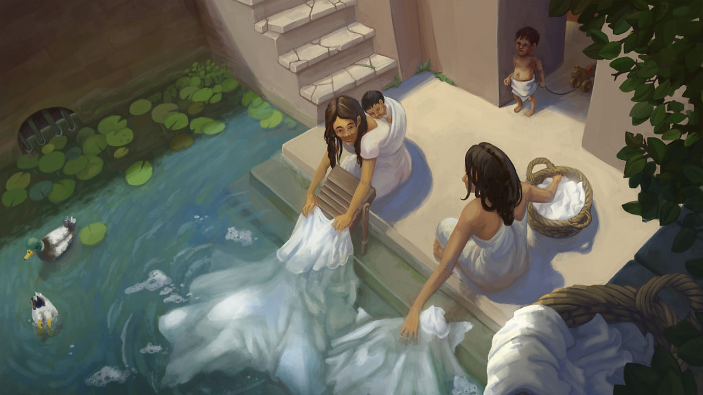
I am deeply inspired and moved by the temple culture in India; the old baths, the life around the staircases... I enjoyed playing with the perspective for this piece 2015
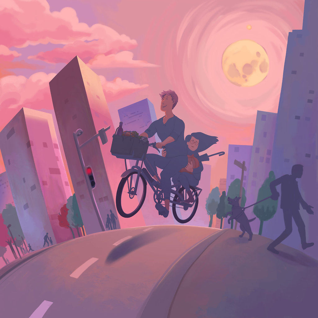
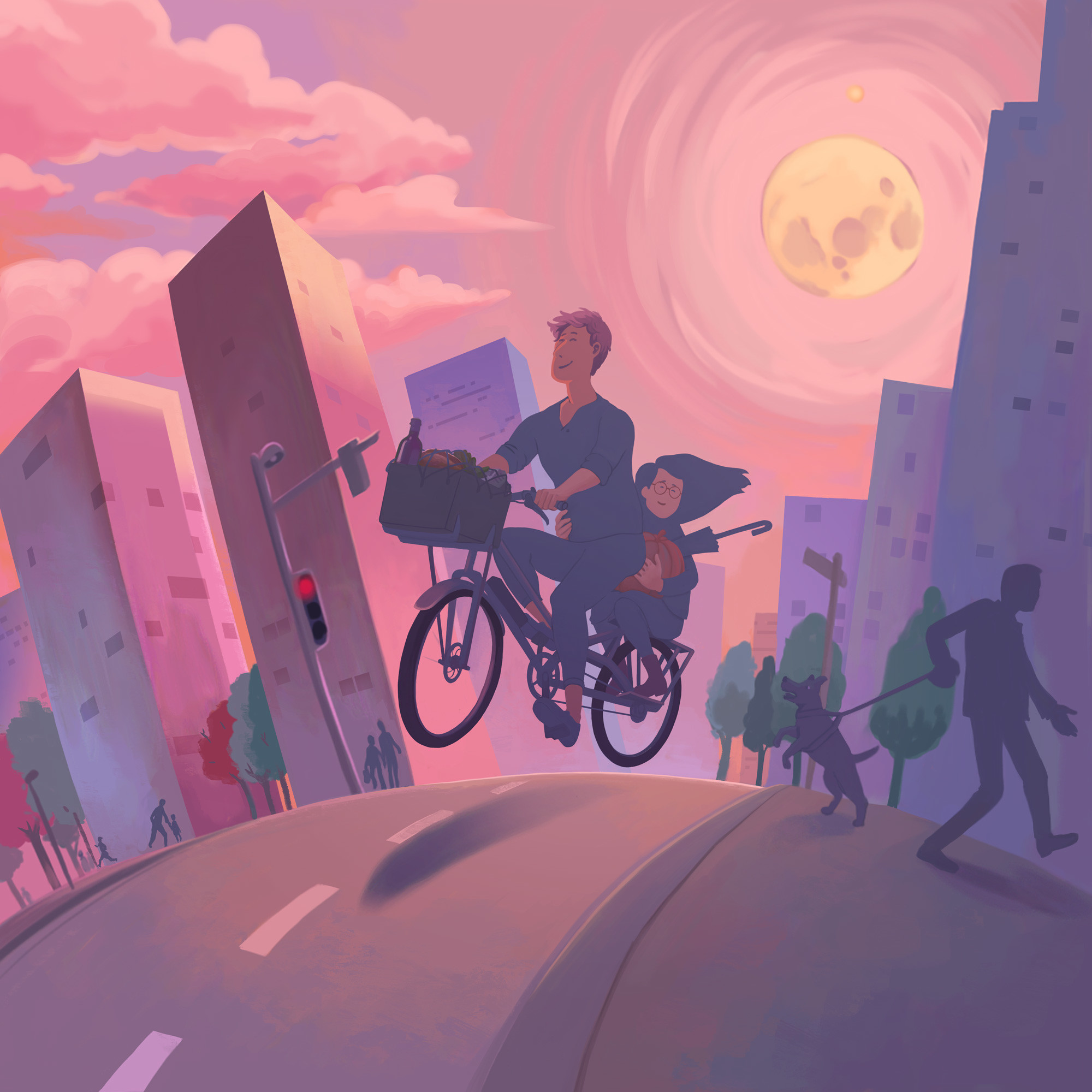
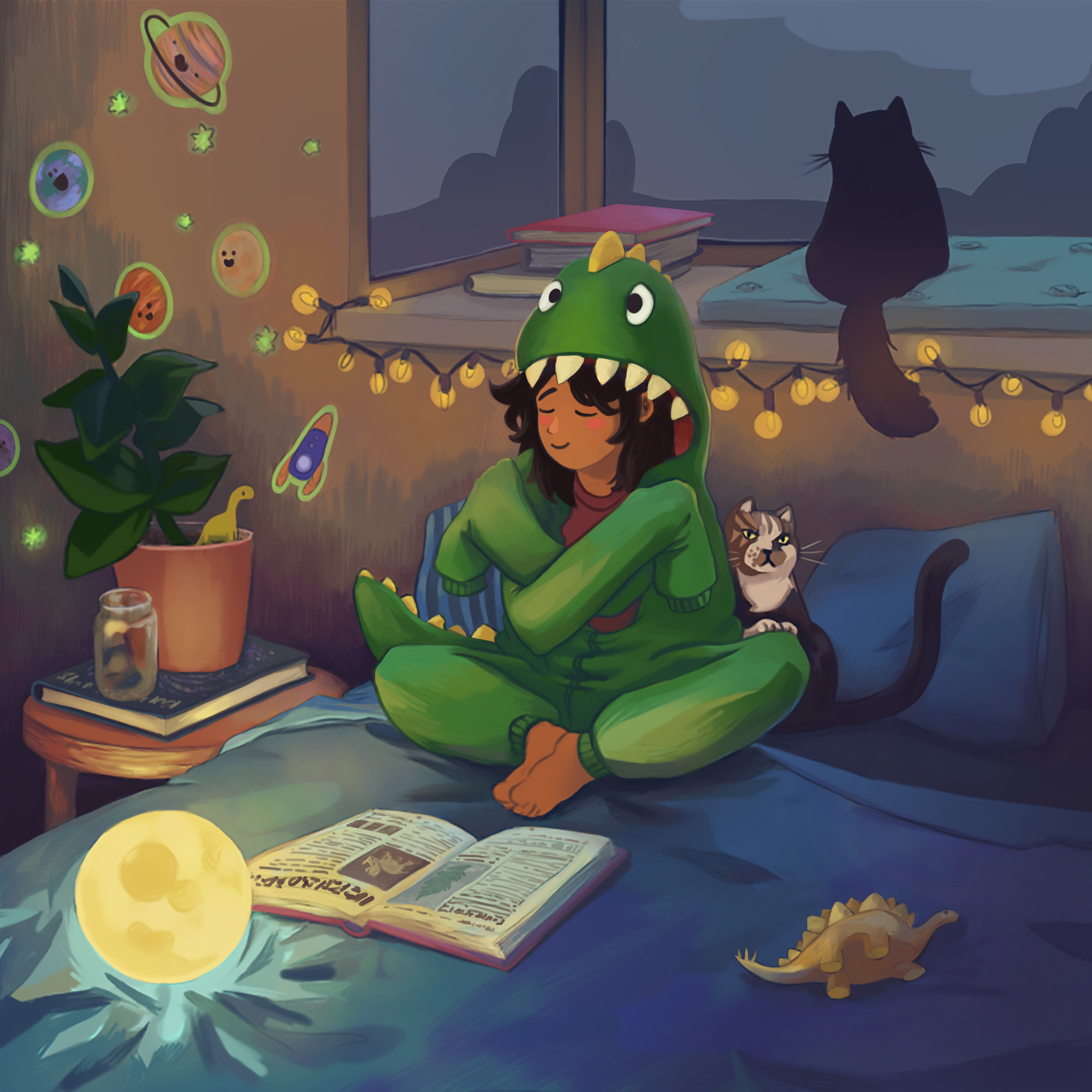
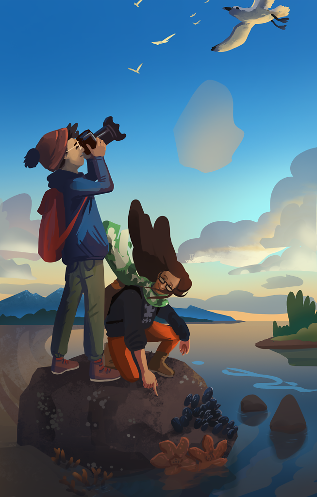
Magical ride - Illustration
2020

Illustration
2016

The kid - Illustration
2020

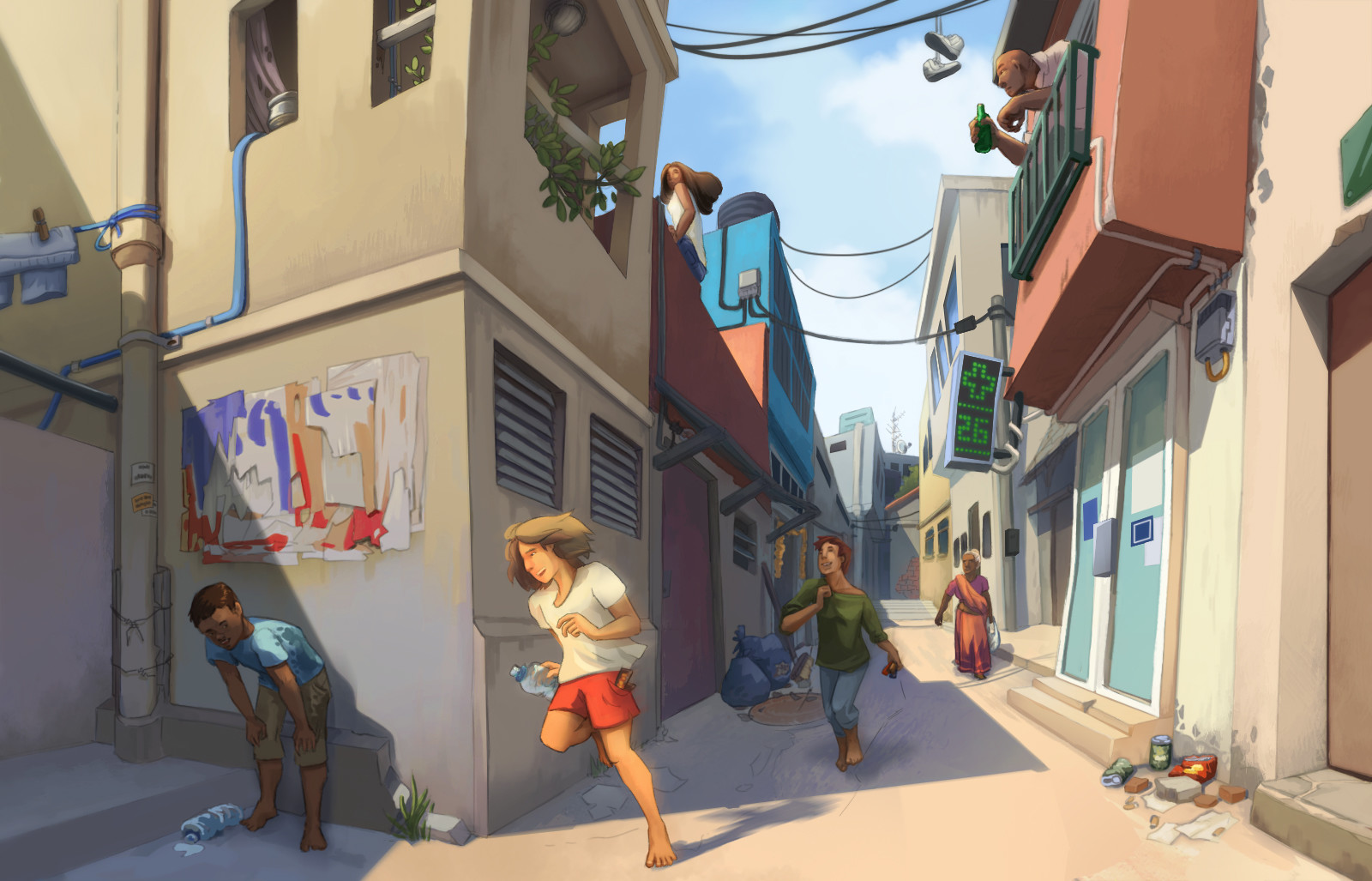
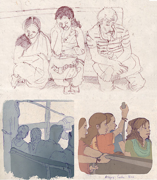
Traveling live sketches
I took the habit to sketch every time I take a transport in India. Bus, boat, train... I add the colors later on, with Photoshop. I hold a travelling blog to tell my adventures with text, sketches and photos. 2015
. This is the 3rd book of the series.<br>I was given a text storyboard. The two males character design was already defined in the previous book.<br>I first scribled the storyboard on paper, then work the lineart on Gimp. I colored and added the texts on photoshop.<br>
2013%3C/p%3E&click_thru=http%3A%2F%2Fwww.annaparmentier.com%2Falbums%2Fpersonal-work%2Fcontent%2Fpage-11-of-the-book%2Flightbox%2F)
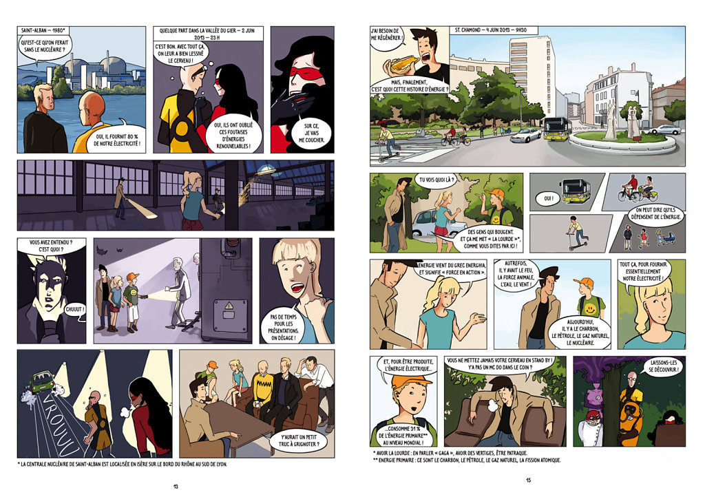
Two pages of the comic book
During the summer 2013, I drew a comic about energies. This work was a commissioned work from the House of Ecology in St Etienne (France). This is the 3rd book of the series.
I was given a text storyboard. The two males character design was already defined in the previous book.
I first scribled the storyboard on paper, then work the lineart on Gimp. I colored and added the texts on photoshop.
2013
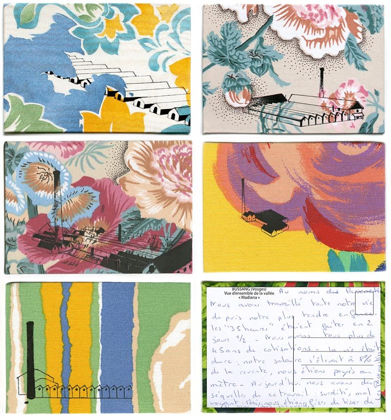
Art project: fabric postcards
The XX th century saw the birth and the death of the Vosgien Textile Industry. Today there are only empty spaces in the territory left. Like wounds in the Vosges' history. I chose to show only a kind of sweetness. The transience of those factories' existence which lasted less than a century. Melancholy remembrance of a bygone era – time of full employment, union struggle, growth, hope of better tomorrows. Memories are of course polished by time; « It was nice... But hard too. It wasn't like now ». Here begins the resilience process. Sand and grass have replaced those industrial areas. The postcards serve as a relay to collective memory. Photographs pass from hand to hand, drawings appeal to remember. These are thin, clumsy, close to be swept by the pattern. But finally, it doesn't evoke the Vosges only, it evokes our parents', great parents' or great great parents' history, as a collective family album.
A series of 17 fabric postcards with testimonies written on the back. The fabrics are originated from the factory in which my grandfather worked his whole life. I have drawn the factories using as reference photo-cards of the north-east of France.
Read more about the project Carte Postales Grand Teint
2012
Tofino - Illustration
2018
Character design and mood for Those Who Wander
Once the main character was sketched, I created a more detailed and developed environment that suits him and the game.

Mood concept for Those who wander
After the universe for TWW was put on paper, I made concept thumbnails, pushed some further into illustrations, using photo bashing to fast render the mood and feel of the game.
Gameview concept Those Who Wander
This concept use as base the white boxing of our very first build. Since the game is in top view, this concept was the occasion to think how to use that very specific perspective to convey the mood, think the overall colors of the game and the shapes of the props. This comes after a lot of individual black and white sketches of props, at last colored and unified into a concept that guides us in our vision of the game.
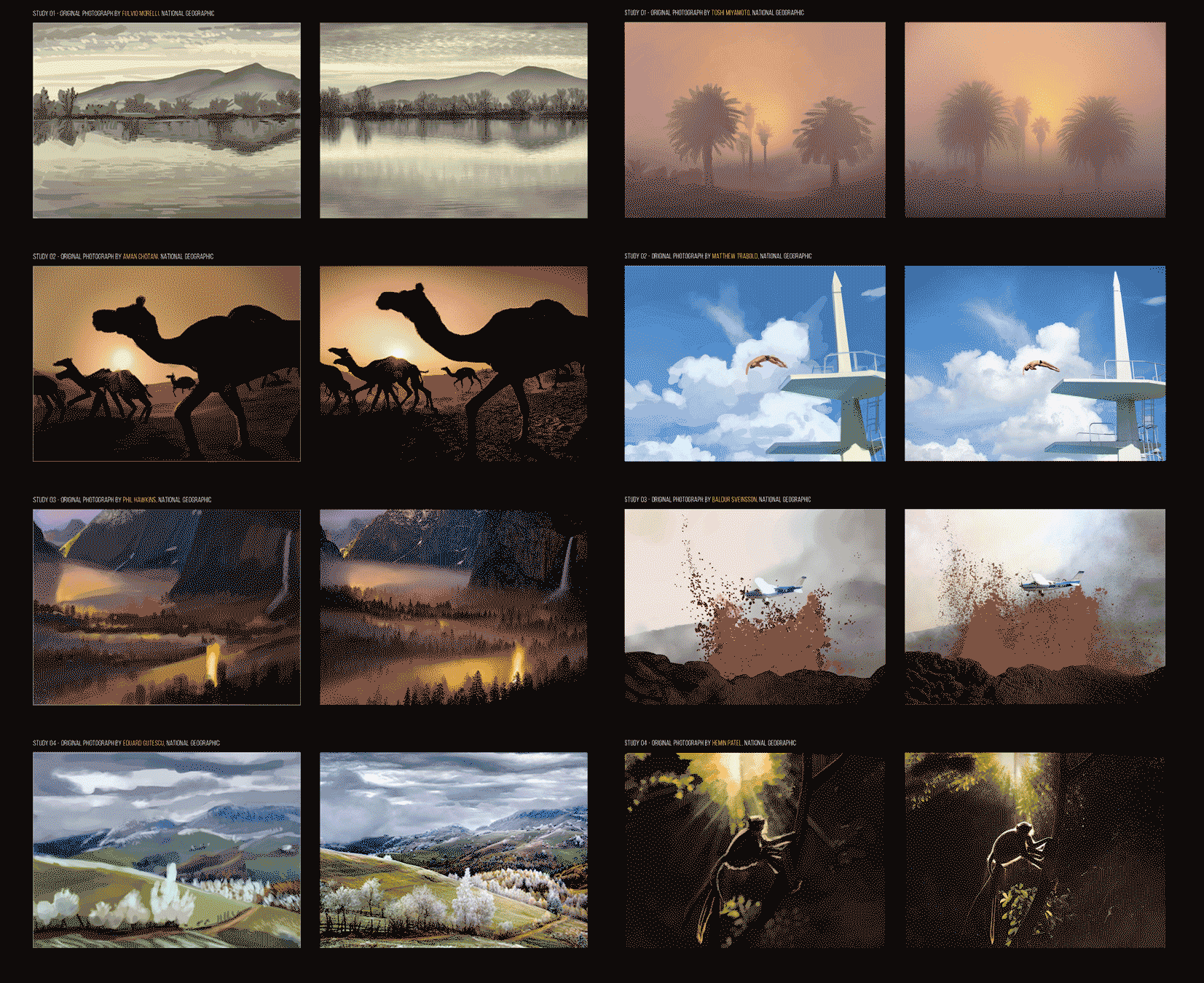
Color studies
While I have always been drawing, 2010 was roughly the year I seriously got into digital artworks. It really took a leap forward after I started the "sessions": daily photo studies focused mostly on the colours. I must have done about 600 in the span of 3 years. I spend 15 minutes on each, and color pick afterward to understand where my analyse went wrong. I consider vital to perpetually study from nature and from photos.

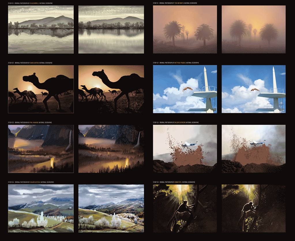
Enemy for Those Who Wander
After deciding on a general idea, I sketch a lot. Once a few drawings seem to really work, I do a more precise render that will guide me for the 3D modeling.

Freya et moi - Illustration
2020

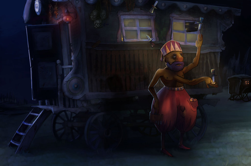
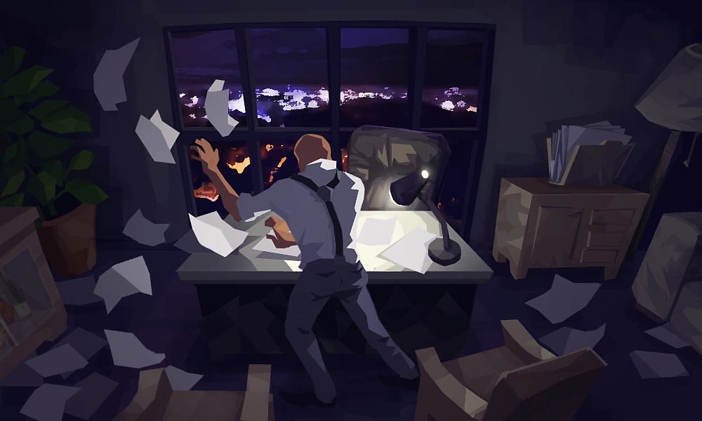
Bankrupt - Illustration
Research of mood and lighting, experimentation of sharper render style. 2015
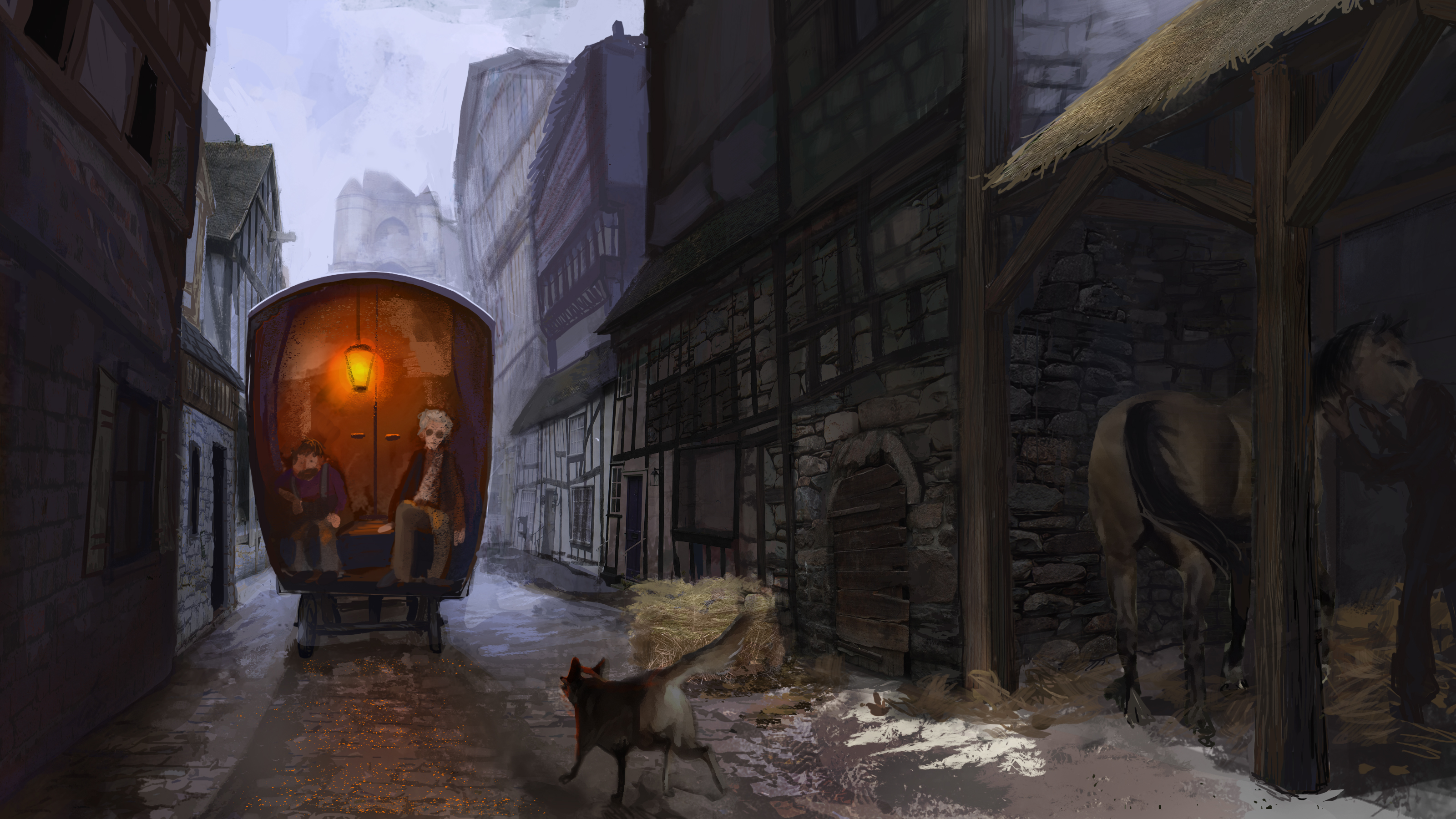
Concept
Series of scenes for an ongoing environment project. 2016

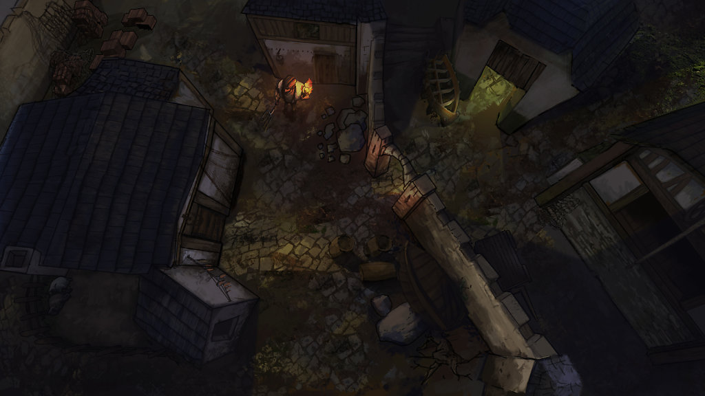
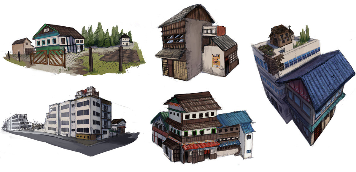
Salvation's Winter building researches
For an alternative universe on the island of Sakhalin, where the Russian and Japanese culture would have merged and then be devastated. The game was to be in top down view.